Adding a Button to a ControlBar
Description
You can add a button to a ControlBar and then associate an action (i.e. some Javascript code) to run when the button is tapped.
To see how to add a button to a ControlBar watch the video or read the guide below.
Adding a Button to a ControlBar
In this video we show how you can add a button to a ControlBar and then associate an action (i.e. some Javascript code) to run when the button is tapped.
This guide demonstrates how to create a button that can navigate through a list control using a javascript action.
Add a Button with an SVG Icon to a ControlBar
In the UX Builder open the Properties page. Click on the [...] button next to the Style name property in the UX Properties section.
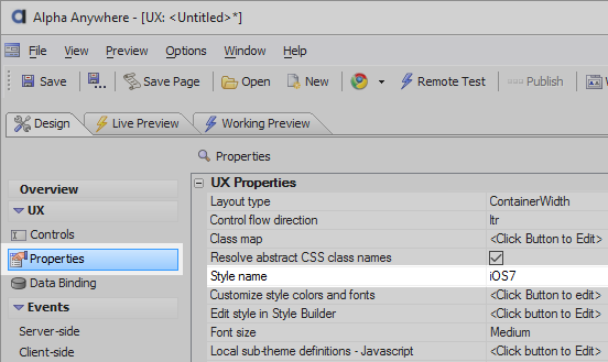
In the 'Select Style' dialog under 'Location' select 'System', then choose the 'Alpha' style from the top of the list. Click OK
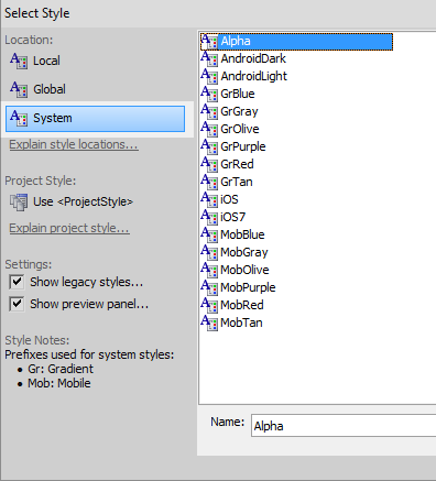 Choosing the Alpha style will give you access to a large selection of pre-defined mobile SVG icons.
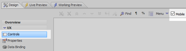
Open the 'Controls' page. From the toolbar menu on the Controls page check the 'Mobile' checkbox.
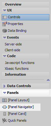
Open the 'Panels' menu and click the [Panel Navigator] option to add a Panel Navigator to the control.
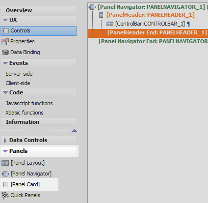
Highlight the Panel Navigator in the tree. Open the 'Containers menu' on the left and click on the [Container] option.

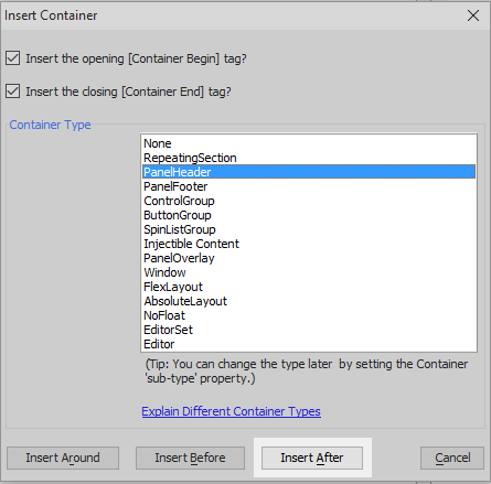
Select 'PanelHeader' from the Container Type list on the Insert Container dialog. Click 'Insert After.
Highlight the PanelHeader. Open the 'Other Controls' menu. Scroll down the list and select [ControlBar] to add a control bar to the Panel Header.

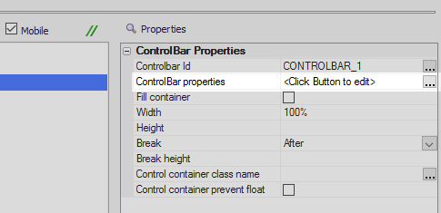
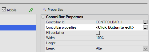
Highlight the ControlBar control. In the control properties list on the right click the [...] button next to the ControlBar properties property to open the ControlBar Builder.
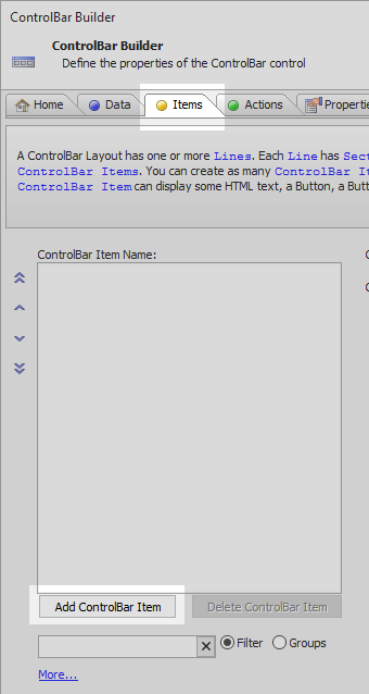
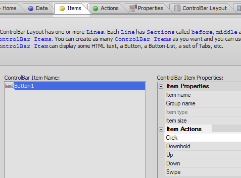
In the ControlBar Builder open the 'Items' pane and click the 'Add ControlBar Item' button.
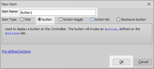
Select the 'button' option in the 'Item Type' list and click OK.
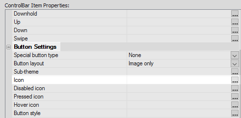
Still on the 'Items' pane, scroll down the button's properties list to the 'Button Settings' section. Click the dropdown next to the 'Button layout' property and select 'Image only'.

Click the [...] button next to the Icon property.
In the Specify Image dialog check the 'SVG Icon' radio button and then click the 'Select' button.

From the style SVG icons select the down arrow icon. Click OK and OK again.
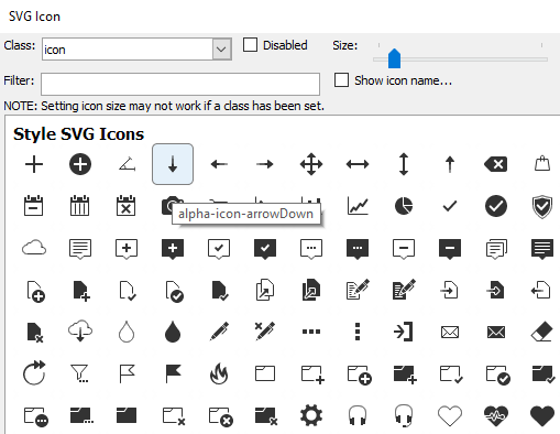 The 'Size' slider at the top of the SVG Icon dialog lets you set the size of the icon class.
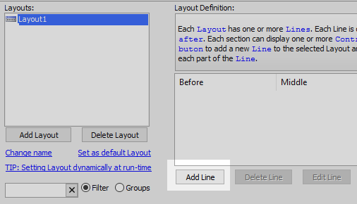
Open the ControlBar Layout pane and click the 'Add Layout' button.
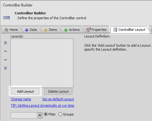
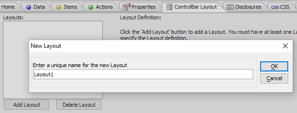
Give the layout a name, like 'Layout1', and click OK.
Highlight the named layout. Click the 'Add Line' button in the Layout Definition section of the pane.
Click the 'Add' button in the 'After' section of the Edit Layout Line dialog.
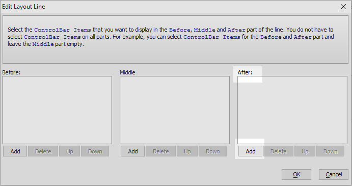 'before', 'middle', and 'after' are used instead of left or right because layouts can also be vertical.
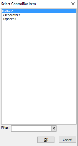
Select 'Button1' and click OK. Click OK again to close the ControlBar Builder.
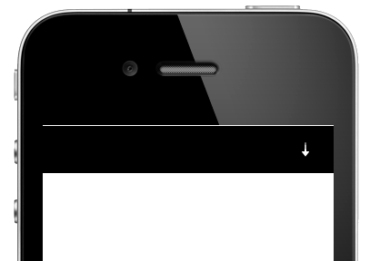
Run the component in Working Preview. You should see the icon button appear in a control bar. When you hover over the icon it should appear blue. The button doesn't have any functionality yet, this will be added in the next section.
ControlBar Buttons and Javascript
This is a continuation of the section above.
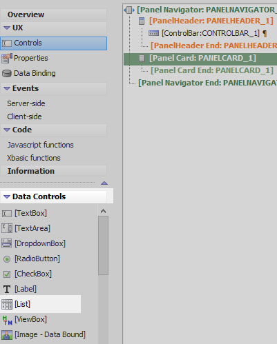
On the UX Controls page highlight [PanelHeader End:PANELHEADER_1]. Open the 'Panels' menu and select the [Panel Card] option. Click on 'Insert After' to add a Panel Card underneath the Panel Header.
Highlight the Panel Card. Open the 'Data Controls' menu and click on [List] in order to add a list control inside the Panel Card.
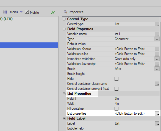
Highlight the List control. In the properties menu on the right click on the [...] box next to the 'List properties' property in the 'List Properties' section. The List Builder will open.
Open the Data Source pane of the List Builder. Set the Data Source Type to be 'SQL'.
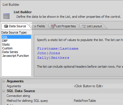
In the SQL Data Source properties section set the Connection string to be the Northwind database.

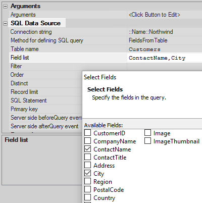
Set the 'Table name' property to be the 'Customers' table.

Click on the [...] button next to the 'Field list' property, select the 'ContactName' and 'City' fields and click OK.
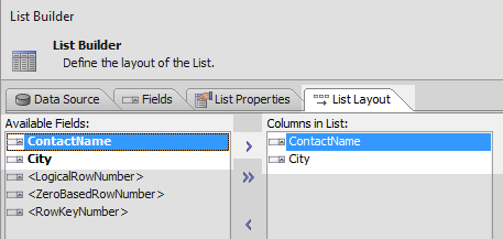
Use the blue > arrow button to move the 'ContactName' and 'City' fields from the 'Available Fields' list to the 'Columns in List' area. Click OK to close the List Builder.
Highlight the ControlBar control. In the properties section on the right click on the 'ControlBar properties' property to open the ControlBar Builder.
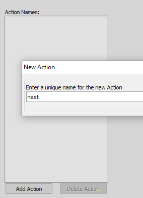
Open the 'Actions' pane and click the 'Add Action' button.

Give the action the name 'next'.
Add the following javascript code to define the new action.
var lObj = {dialog.object}.getControl('list1');
lObj.navigate('next');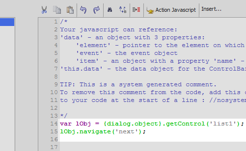
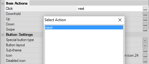
Open the 'Items' pane and highlight 'Button1'. In the 'Item Actions' section click the [...] button next to the Click property.
Select the 'next' action that you just defined.
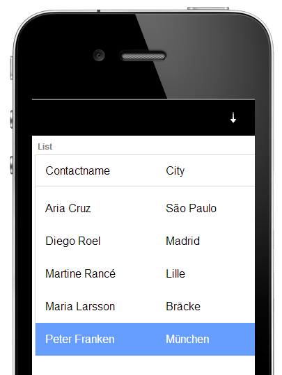
Click OK to close the List Builder. Run the component in Working Preview. Now when you click on the 'down' icon you should see the cursor move through the list.
Adding Additional Navigation Actions
You can add additional navigation to the example shown in the section above. The following javascript should work if you wanted to add an action to a button in the ControlBar that moves a cursor to the previous field in a list control.
var lObj = {dialog.object}.getControl('list1');
lObj.navigate('previous');
To create an item that skips to the first row of the list control, define an action with this javascript:
var lObj = {dialog.object}.getControl('list1');
lObj.navigate('home');
To cause the cursor in the list control to move to the end of the list define an action with this javascript:
var lObj = {dialog.object}.getControl('list1');
lObj.navigate('end');